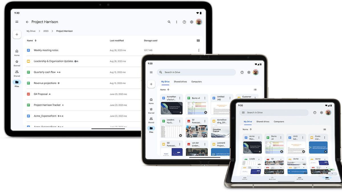


JAKARTA Google announced that the Google Drive display on Android tablets and foldable devices will change. User Interface (UI) websites will be implemented on these two devices.
Previously, devices such as cell phones and tablets had a folder hierarchy in the lower left corner of the screen. But on the latest display, this folder hierarchy has been moved to the top of the screen.
Placement of this folder hierarchy is exactly like a website. But the menu arrangement under this folder hierarchy is different because tablets and foldable devices still use menus such as Home, Starred, Shared, and Files.
All of these menus are arranged to decline under the folder hierarchy, very different from the appearance on regular devices. Generally, all these menus are horizontally arranged at the bottom of the screen.
In addition to differences in the hierarchy of folders and their following menus, these two devices also adopt data columns from websites with document sequences, date of the last document is changed, and the amount of storage each document spends.
SEE ALSO:
-
 | BERITA
Di Hadapan Anies-Muhaimin, PA 212 Bicara Komando Rizieq Shihab Sukseskan Anies di Pilgub DKI
18 November 2023, 12:26 -
 | BERITA
Anies-Muhaimin Hadiri Ijtima Ulama GNPF, Tegaskan Ulama Mitra Umarah Bukan Musuh
18 November 2023, 11:33 -
 | BERITA
Ridwan Kamil Jadi Ketua Tim Kampanye Prabowo-Gibran di Jabar, TPN Ganjar-Mahfud Tak Gentar
18 November 2023, 11:20 -
 | BERITA
Cawapres Mahfud MD Pulang Kampung ke Madura, Jembatan Suramadu Dipenuhi Pendukung
18 November 2023, 10:40

Finally, Google added an update to its color palette. According to Google, the color palette they are using is in accordance with Google Material Design 3 guidelines. This change makes the grid of folders and files placed on the card, while the file name appears at the top.
All of these changes will be rolled out on 27 November. Google Workspace users and personal Google accounts will get this update. Make sure to update your device for a better look.
The English, Chinese, Japanese, Arabic, and French versions are automatically generated by the AI. So there may still be inaccuracies in translating, please always see Indonesian as our main language. (system supported by DigitalSiber.id)