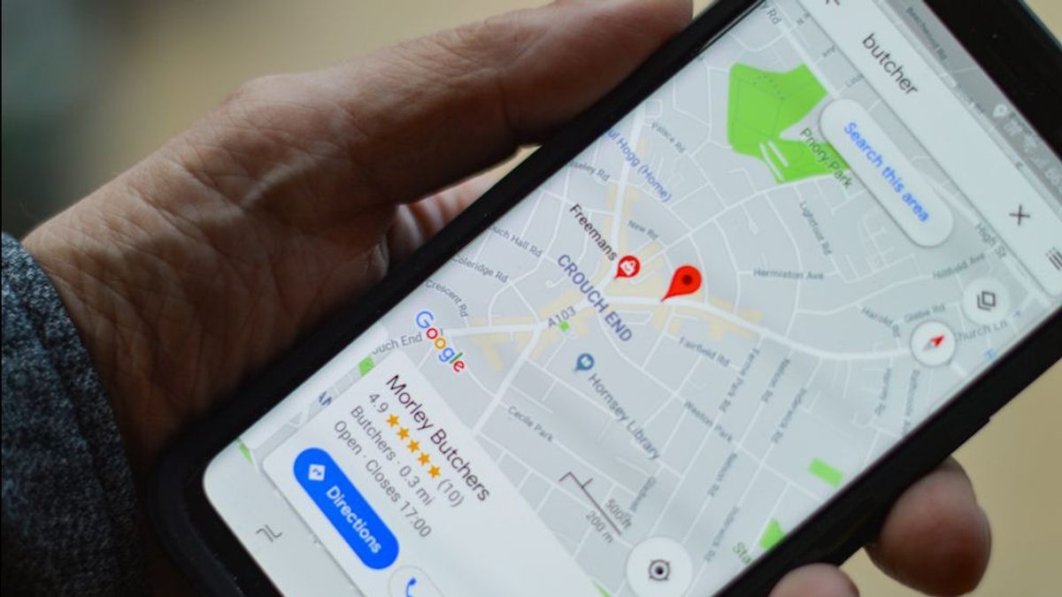


JAKARTA Google redesigned the user interface (UI) from Google Maps worksheets. The latest design of this directional guide application is being rolled out to all devices with an Android operating system (OS). Based on a 9to5google report, Maps' work sheet has a more rectified angle than before. With this change, the background of the worksheet, namely the digital map, will stand out because it is more visible. When the workheet is pulled up, the background will become darker so that users can focus on looking for the information needed. When the workheet is removed, the map in the background will look much brighter. Another visible change is the button to remove the background quickly. Previously, users had to manually lower the workheet to view the map in the background. However, now that method has been removed. Users can press the cross button in the upper right corner. When the work sheet appears, users cannot click the search bar or map to immediately find the desired place. They must press the cross button first.
SEE ALSO:
-
 | TEKNOLOGI
NASA Peringati 55 Tahun Misi Apollo, Pendaratan Manusia Pertama di Bulan
15 Juli 2024, 09:35


In addition to the changed workheet, the search box to enter the current location and the intended location has also changed. If previously the search box looks full at the top of the screen, now the blades are seen floating with a rounding angle. This latest design of Maps is being extended to the Android app with version 11.136.x and is not yet visible across the device. It is not yet known when this change will be added to iOS as updates on Android are still being made in stages.
The English, Chinese, Japanese, Arabic, and French versions are automatically generated by the AI. So there may still be inaccuracies in translating, please always see Indonesian as our main language. (system supported by DigitalSiber.id)
Most Popular Tags
#Prabowo Subianto #donald trump #2026 World Cup #venezuela #konflik timur tengahPopular


