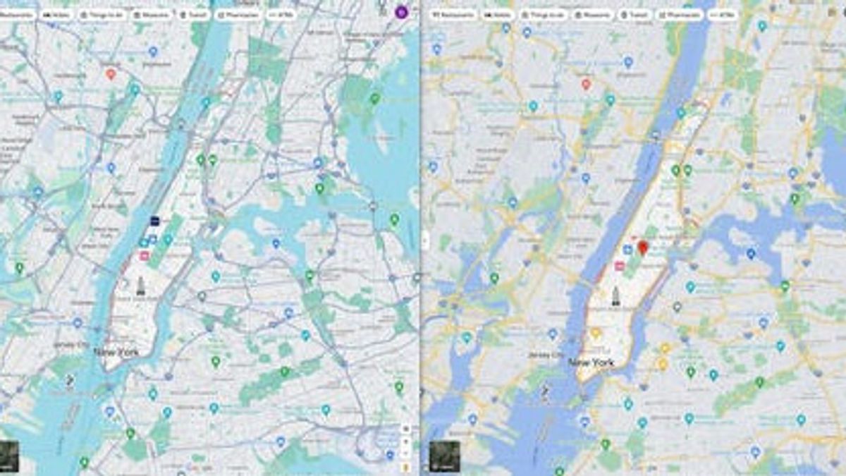


JAKARTA - Google recently updated the User Interface (UI) color palette of its Maps app on mobile and desktop, which received a lot of comments that it looks similar to Apple Maps.
This update, which is still in testing, indicates that Google has gone one step further to finally abandon its traditional Maps view.
The biggest visible change is the colors of city blocks or streets that used to be gray and white, now are white and gray.
The dark gray streets used to represent toll roads and freeways are immediately reminiscent of Apple Maps.
There is also the yellow color used for highways, now used to limit lanes with moderate congestion.
Bodies of water such as lakes, streams or rivers have been changed by Google from a bluish lavender color to a greenish blue color.
SEE ALSO:
-
 | TEKNOLOGI
Ripple Tolak Mosi SEC: Akankah Perseteruan Hukum Regulator dengan Ripple Berlanjut?
04 September 2023, 06:05 -
 | TEKNOLOGI
Siap-siap, Vitalik Buterin Jual 500 Token MKR Senilai Rp8,8 Miliar!
04 September 2023, 05:05 -
 | TEKNOLOGI
Honor Mengungkap Konsep Ponsel Lipat Bernama "Honor V Purse" yang Bisa Jadi Tas
04 September 2023, 03:05 -
 | TEKNOLOGI
India Mematikan Penjelajah Bulannya Setelah Misi Berhasil di Kutub Selatan Bulan
04 September 2023, 02:04

In contrast, the colors of bushes and forests have a bluish hue, washing out the green of the leaves for a desaturated emerald green.
The bottom bar in Google Maps is also shorter than before, with the lack of Material You's dynamic theme. Luckily, the web interface and dark mode UI on mobile devices is completely unchanged.
According to reports, Apple Maps was also caught adopting a Google Maps feature, where the company allows users to download maps.
The map can later be accessed by users offline. This feature can be seen in the iOS 17 software update that will be coming in September, as quoted from CNET and Android Police, Monday, September 4.
The English, Chinese, Japanese, Arabic, and French versions are automatically generated by the AI. So there may still be inaccuracies in translating, please always see Indonesian as our main language. (system supported by DigitalSiber.id)
Most Popular Tags
#Prabowo Subianto #donald trump #2026 World Cup #Febrie Adriansyah #8791Popular


