


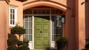
Choosing the color of the minimalist house door looks simple, but in reality it can be quite complicated. Because, the color of the door is not only a decorative element, but also the impression that people see first about your house. Choosing the wrong color can make the fas'ad seem less balanced, too flashy, or lose the character instead. In order not to be mistaken, there are several common mistakes that you should avoid when determining the color of the door to the house is minimalist.
Many people choose colors only based on their preferences, without thinking if they match their home style. In fact, the color of the door that is not in harmony with the character of the house can make the appearance of the fasad look odd. A minimalist house with neutral palettes, for example, will look strange when paired with overcrowded colors without visual consideration. Always make sure your color choices support the concept of home's main design.
Another big mistake is choosing the color of the door without paying attention to the color of the walls, roofs, frames, or fences. As a result, the door can look like an uncoupled foreign element. Quoting Better Homes & Gardens, Friday, November 21, the color of the door should be an accent, but it still blends with the entire exterior palette. You can use contrasted colors, but make sure the contrast remains harmonious and does not collide with each other.
Dark colors are elegant, but their use must be appropriate. If the front area of the house is less light, the color of the door that is too dark can make the fasad feel gloomy. In addition, dark colors tend to absorb heat so it may be uncomfortable for the tropical climate. Consider the intensity of natural light in the door area before determining whether dark colors are ideal choices.
Color trends are tempting, but not all of them are suitable for the long term. Colors that are currently popular can be felt quickly 'missing the times' in a year or two. Because a minimalist house usually prioritizes the impression of timeless, it's a good idea to choose a color with a long aesthetic life. In addition, adjust the trend you want to follow with the character of the house so that it still looks relevant in the long term.
Not a few homeowners choose colors just because they are beautiful to see in the catalog. In fact, not all colors survive both against heat, rain, and UV light. Certain colors tend to fade quickly or leave more pronounced stain marks. Make sure your door paint has good exterior quality and is weather resistant so that its color remains beautiful in the long term.
SEE ALSO:
-
 | LIFESTYLE
7 Rekomendasi Warna Pintu Rumah yang Bagus, Bikin Fasad Semakin Stylish
17 November 2025, 17:47 -
 | MUSIK
Lagu Galau Sedih Bikin Nangis: 100 Lagu Indonesia yang Harus Didengar
17 November 2025, 11:35 -
 | LIFESTYLE
6 Kesalahan Desain Kamar Mandi yang Paling Sering Disesali, Pelajari Sebelum Renovasi
12 Oktober 2025, 17:47

Your house is also part of the visual environment around it. Too prominent door colors can make the house look 'asing' among other buildings. Adjusting the theme of the surrounding environment does not mean it must be the same exactly, but having visual alignment is important. Choose the color that makes your house look attractive without being seen colliding with the feel of the environment.
Mistakes in choosing minimalist house door colors are actually easy to avoid if you understand the principles of harmony, lighting, and design alignment. By considering exterior colors, home style, and environmental factors, you can get a door that is not only beautiful but also strengthens the overall character of the house.
The English, Chinese, Japanese, Arabic, and French versions are automatically generated by the AI. So there may still be inaccuracies in translating, please always see Indonesian as our main language. (system supported by DigitalSiber.id)


