


JAKARTA Google will update its two application logos, namely Google Maps and Google Photos. This update continues the gradient design trend introduced through the Google and Gemini application icons.
This gradient icon was first introduced in May 2025, where Google removed four solid parts of color for the first time. After that, the design was extended to Gemini Spark the following month.
Despite changing the solid design to a gradient, Google stated that they will remain loyal to its four iconic colors. Google also deliberately changed its design to a gradient to describe the creativity of its AI technology
SEE ALSO:
-
 | TEKNOLOGI
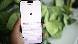
Telkomsel dan OpenAI Hadirkan Bundel ChatGPT Go Pertama di Asia Tenggara
03 November 2025, 17:05 -
 | TEKNOLOGI
Bigo Live Berdayakan Kreator untuk Dukung Perekonomian Digital Indonesia
03 November 2025, 16:35 -
 | TEKNOLOGI
Bitcoin Tutup Oktober di Zona Merah, November Jadi Harapan Bullish
03 November 2025, 16:05 -
 | TEKNOLOGI
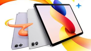
Xiaomi Akan Luncurkan Redmi Pad 2 Pro di Indonesia pada 7 November
03 November 2025, 15:35 -
 | TEKNOLOGI
Indosat Catat Pendapatan Rp14 Triliun di Q3 2025 dan Sudah Operasikan 208.000 BTS 4G
03 November 2025, 15:05
For Google Maps, the new icon is still in the form of a location pin, but with a modernized and slimmer shape. However, the inner circle of the pin now looks much bigger than the previous design.
Launching from 9to5google, Google removed two diagonal-shaped dividers on the Maps pin. Meanwhile, the Google Photos icon will retain its familiar shape, but further highlight the gradient effect that radiates from the inside to the outside.
This effect makes the logo look more lively and modern. This design change is also considered to be more highlighting the AI features in the Photos application, for example such as the Remix tool, changing photos-to-videos using Veo, and the Ask Photos feature.
Looking at this upcoming Google Photos and Maps logo, Google seems to want to expand this change to more of its products to represent Google brands. This logo change will continue to more products in the coming months.
The English, Chinese, Japanese, Arabic, and French versions are automatically generated by the AI. So there may still be inaccuracies in translating, please always see Indonesian as our main language. (system supported by DigitalSiber.id)


