JAKARTA YouTube has just announced an interface design (UI) update that includes various platforms such as mobile, web, and TV. With the addition of subtle opaque glass effects and some new features, this update aims to simplify user experience on the YouTube platform.
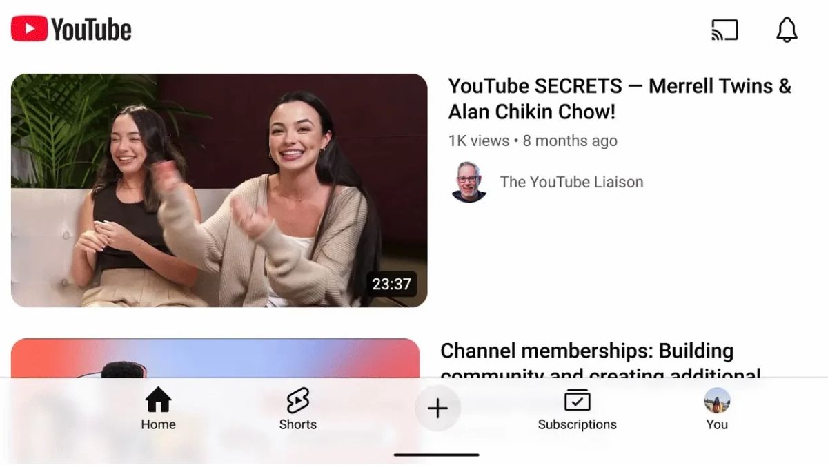
On all platforms, YouTube is updating the look of bottom navigation bars with new icons for Home, plus', Subscriptions, and You menus. In addition, opaque glass effects are now up and down on mobile and web apps, providing a more immersive cruising experience with transparent views.
In the YouTube Music web application, there is a touch of pink color that appears in the scrub section, giving a dynamic feel to the user's familiar appearance.
For YouTube on mobile devices, landscape modes are now updated with larger thumbnails and easier-to-read text. This update was first launched for Android and will follow to iOS later this year.
SEE ALSO:
Meanwhile, on a television platform, YouTube presents a more cinematic touch of design. More immersive channel pages will automatically play selected videos from creators as teasers, making it easier for users to watch videos quickly.
In addition, YouTube also features new Shorts players on TV, allowing users to read comments or explore stores without having to stop the video being played.
Overall, YouTube has announced more than two dozen upgrades in its latest update, providing a fresh and more interactive experience for its users
The English, Chinese, Japanese, Arabic, and French versions are automatically generated by the AI. So there may still be inaccuracies in translating, please always see Indonesian as our main language. (system supported by DigitalSiber.id)
