JAKARTA YouTube Music tested the artist's page design last July to change the key size and add new features. After more than a month of testing, the redesign of the Artist's page was finally launched.
The latest design from the YouTube Music Artists page was supposed to be launched on September 4, but the launch was canceled for unknown reasons. However, YouTube re-launched its design on Sunday, September 8.
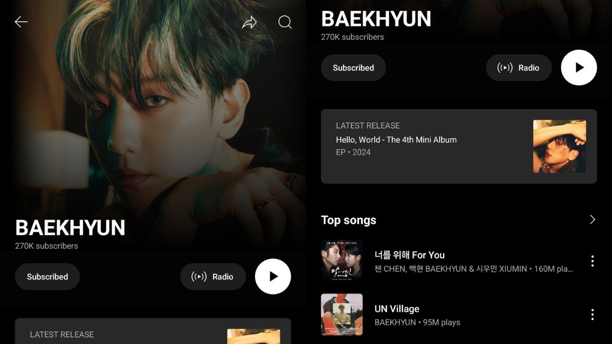
In the previous version, the YouTube Music Artist page features the name of the artist or musician at the top center with a description of the number of subscribers at the bottom. In the latest design, YouTube Music moved the position of its name and number of subscribers.
The Font used by YouTube Music is much smaller and denser when compared to the previous design. The name of the artist or musician has been moved to the left side of the screen, followed by a description of the number of customers who are still at the bottom.
SEE ALSO:
YouTube Music also displays subscription buttons at the bottom of the number of subscribers. With this button, users can subscribe or stop subscribing easily. When you first subscribe, the button will display the effect when tapped.
Meanwhile, the Radio button and Play Song are placed parallel to the Subscription button. The two buttons are placed on the right side of the screen. The Play Song button is made bigger than the Radio button with a white background, while the Radio is set black.
At the bottom of the button, YouTube Music users will see the latest Album or Single embedded with the Album or Single title caption, release year, and cover on the left side of the window. If clicked, the playlist from the album will appear.
The English, Chinese, Japanese, Arabic, and French versions are automatically generated by the AI. So there may still be inaccuracies in translating, please always see Indonesian as our main language. (system supported by DigitalSiber.id)
