JAKARTA Last August, Google launched a new interface view from Google Meet. This update was launched for Meet applications on mobile phones, tablets, or other devices with Android systems.
After updating the interface view of the Google Meet app for two weeks, Google announced that the launch stage had been completed. All Google Meet users on Android can already see a better view than before.
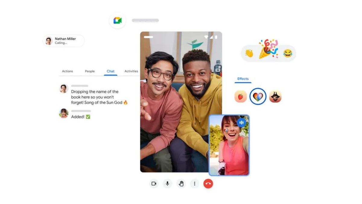
"Now you'll see a slimmer and more space-efficient experience with video from end to end. We've expanded the video feed to cover the space previously in the form of margins around the video feed," Google said on the update page.
Google says that the scheduled Release and Release never takes more than 15 working days as the launch is carried out simultaneously. "If not (at the same time), each launch stage will not take more than 15 working days to complete."
SEE ALSO:
In an interface update that Google releases, the meeting room will look like a regular video call made on social media. The screen display becomes more full and the meeting control is made slimmer than the previous look.
"This helps provide a richer and deeper viewing experience. You will also see a slimmer user interface for meeting control, and clearer indicators for information such as meeting titles," Google explained.
In addition to changing the interface, Google has also added several new features such as piled-up effects, easier emojis, to traveling modes on calls. All these updates can be used by Workspace subscribers and users of personal Google accounts.
The English, Chinese, Japanese, Arabic, and French versions are automatically generated by the AI. So there may still be inaccuracies in translating, please always see Indonesian as our main language. (system supported by DigitalSiber.id)


