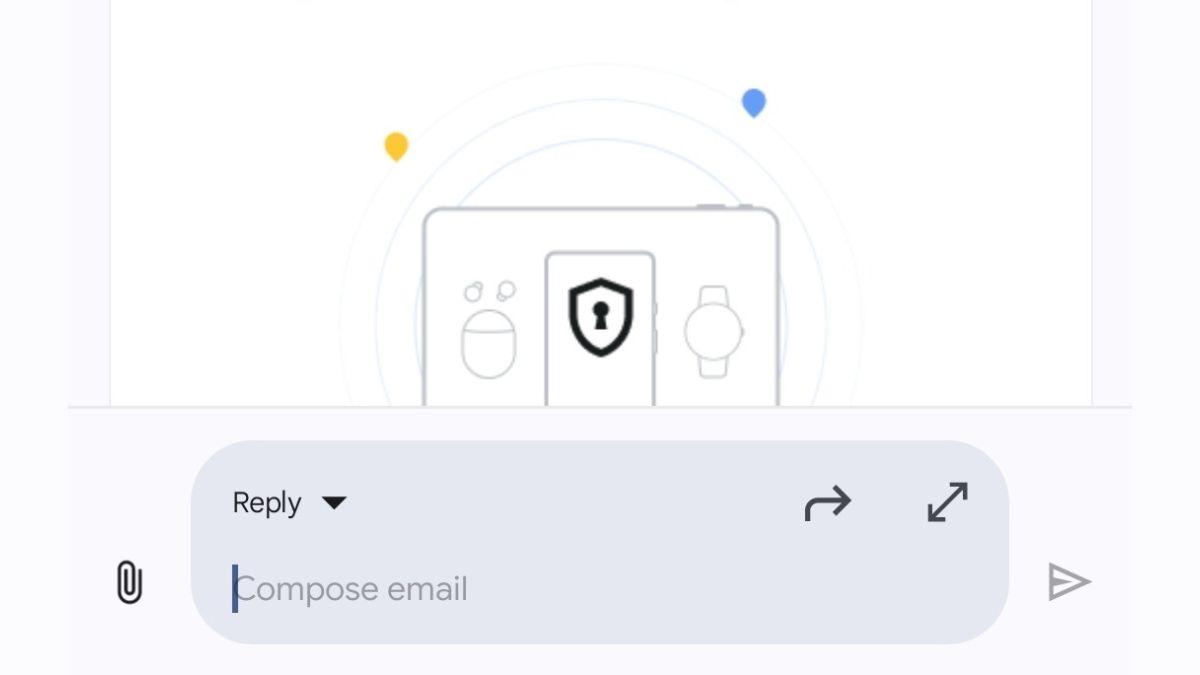
JAKARTA Google changed the appearance of the reply box in Gmail's incoming message on Monday, August 26. This new change will make it easier for users to reply to messages because the display is more efficient. Previously, the reply box could only be displayed in full view so users could not read back the messages they wanted to reply to. If the user exited the reply box, the typed message would go directly into the Draft folder. Google realized that the full screen display was less efficient for many Gmail users, especially for the recipient of the message with such a long content. Therefore, Google updated the appearance of the reply box across the device with the Android system. "Starting today, you can reply to the email directly from the bottom of the conversation, without opening a new screen, making it easier to refer to the email you reply to," Google said on the Workspace service update page. The company added that this update is suitable for users who want to reply to messages briefly and simply. "For longer and more formal responses, you can simply expand the text box to access more information options."
SEE ALSO:
Apparently, this update is released through the server side so Gmail users don't need to update their app. If the latest version of the reply box hasn't been seen in the app you're using, you need to wait for the next 15 days. This latest view will be visible to all Google Workspace subscribers, Individual Workspace subscribers, or users with personal Google accounts. The latest reply box will also be launched to iOS, but at the end of the year.
The English, Chinese, Japanese, Arabic, and French versions are automatically generated by the AI. So there may still be inaccuracies in translating, please always see Indonesian as our main language. (system supported by DigitalSiber.id)
