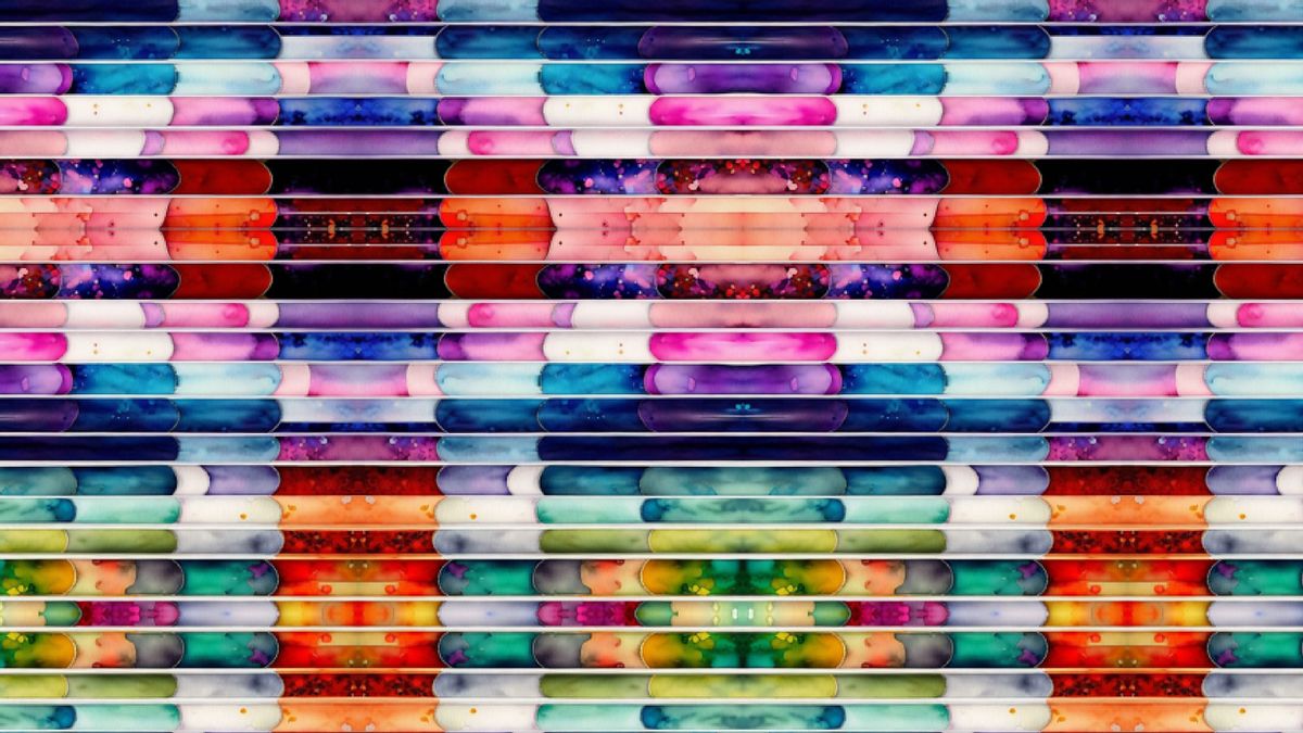


YOGYAKARTA A harmonious color combination can make something look more lively and interesting. For that, a suitable color padupa and is very important.
According to Edwin Buyung Syarif and Jakob Sumardjo's book Introductory for Fine Art Studies, colors are interpreted as expressions of important feelings and contain symbols.
The colors we often see can also have an impact on mood and behavior. In fact, color can trigger physiological responses such as changes in heart rate and metabolism.
Well, this article will discuss a harmonious color combination, so it is suitable for diginization in various places. Let's see the full review below.
Summarized from various sources, here are 20 examples of harmonious color combinations in order to create an interesting visual display:
The first example of a harmonious color combination is yellow and sky blue. The combination of yellow such as sun and sky blue flowers can create a refreshing impression.
The combination of electric blue and lime green creates an impression of enthusiasm. Electric blue color is very suitable combined with lime green, especially in the creation of a logo.
If you want to mix three colors, colors like orange,joint, and custard are the right choice. The three of them can be very suitable for combination and will create a fun atmosphere.
The combination of cherries and rubber red results in an interesting high contrast to see. The combination of the two can be used for product design and logo.
An example of the next harmonious color combination is light butter, mint, and purple. Padupadan ingi color produces warm visual effects. The combination of the three is very suitable for public design.
SEE ALSO:
-
 | INFO SEHAT
Deteksi Dini Jadi Kunci Menghadapi Beban Ganda Penyakit di Indonesia
06 Desember 2025, 18:53 -
 | LIFESTYLE
Eksklusif Celine Evangelista: Antara Tanggung Jawab Profesional dan Panggilan Hati
14 November 2025, 10:10 -
 | LIFESTYLE
Budaya Kerja Sehat yang Bikin Karyawan Betah dan Semakin Produktif
28 Agustus 2025, 19:35

The combination of these two colors results in a feminine, fresh, and eye-catching appearance.
The combination of white and light blue can produce a calming impression. The combination of warn aini gives the sensation of seeing the sky on a bright day ceiling.
The combination of black and yellow can produce a very strong contrast. Even so, the combination of these two colors looks very harmonious, so it is interesting to see.
The easy red color combined with blue can create a harmonious impression. The combination of these two colors also creates a soft impression.
The combination of black and gray produces a classy impression. In clothing, the use of black and gray can create an elegant impression.
Combination of misty and Zamrud also includes a tandemous example of color combination. The combination of the two is very suitable for home design and is applied to unia fashion.
This combination of colors creates a classic feel that is calming and rich in aesthetic value.
The combination of the two warns produces harmony in the earth's color which gives a warm and elegant impression.
Although the colors are both blue, the combination of the two can give you a pleasant impression. This combination is very suitable for those of you who want to look professional.
An example of a matchful combination of colors last is a combination of purple and cream. The use of these two colors is perfect for indoor design.
That's the information about a harmonious color combination. Get the latest news updates only on VOI.id.
The English, Chinese, Japanese, Arabic, and French versions are automatically generated by the AI. So there may still be inaccuracies in translating, please always see Indonesian as our main language. (system supported by DigitalSiber.id)
Most Popular Tags
#Prabowo Subianto #donald trump #2026 World Cup #Febrie Adriansyah #8791Popular


