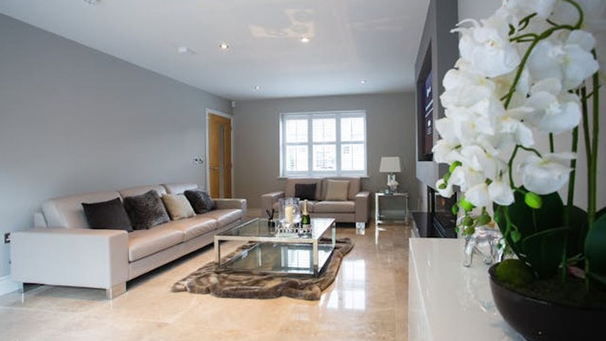
JAKARTA - If it's time to repaint your living room, you should choose a modern and long-lasting color. Avoid outdated paint color from the start will help you repaint your house or regret it because of the wrong choice.
To learn more about the old living room paint color that should be avoided, VOI reported The Spruce, Friday, January 3, asking for expert opinion from two designers. In addition, they also offer alternative options for each color.
If you want to use dark and daring colors for your living room, Philip Thomas Vanderford of Studio Thomas James suggests avoiding the color charcoal gray or charcoal gray.
"In the past, the color of the charcoal gray was the main choice to get a dramatic and modern look," he said.
"However, this color has become very common in recent years so it feels normal now."
He also opposed the use of charcoal colors as living room paint colors because they can make the room feel too heavy and one-dimensional. This creates an atmosphere that feels closed and irritated.
When his client asked for dramatic living room colors, Vanderford suggested choosing a more natural and interesting color than the charcoal gray. The choice is dark or teracity olive green.
Meghan Kluth from Moment of Kluth Designs calls dark blue or navy one of the outdated colors for living room walls. This color is most often used by people as living room paint but it seems ancient.
Similar to the dark charcoal gray, the nature of the navy and cold colors do not make the room feel comfortable. Plus, the navy rarely looks suitable for black, which is an accent color that is difficult to completely avoid.
Therefore, Kluth recommends using white pale color for the living room. Try choosing a blue pale color with a little patina accent, especially if you like the French look.
If you've ever tried white paint, you know that the most subtle basic color change even though it has a dramatic effect on its overall display.
"Over the years, cool white has become a minimalist modern aesthetic background, which provides a fresh and clean look," Vanderford said.
"However, this striking color can be clinical, especially in places that are meant to gather and relax. The trend towards a warmer and more attractive place has made the cold white look too stiff."
Striking and cold white is often seen in laboratories or hospitals, so it's no surprise that the color often feels sterile. However, Vanderford says you don't have to completely avoid white. Warm off-white colors with a little creamy powder are a good alternative according to him. Kluth also mentions striking white colors as colors to avoid and recommend warmer neutral colors such as beige or tape.
SEE ALSO:
According to Vanderford, the test has become the center of attention, and it's time for this color to be retired.
"Teal was once a favorite in the interior design world, adding color powder that wasn't too brave or too safe," he said.
"However, now this color is often associated with trendy interiors in the early 2010s, making a lot of space look outdated."
If you're still a big greenish fan of blue, Vanderford recommends trying out other colors inspired by the sea as wall paint.
"The calm sea survey will give a deep and modern impression without the impression of a special trend for an era," he said.
The English, Chinese, Japanese, Arabic, and French versions are automatically generated by the AI. So there may still be inaccuracies in translating, please always see Indonesian as our main language. (system supported by DigitalSiber.id)


