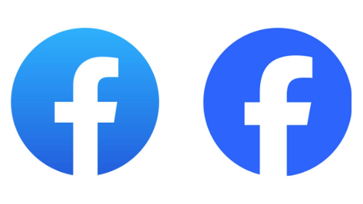


Meta, a large company that oversees several social media, updated the Facebook logo recently. Even though it has been changed, not everyone will be aware of this change.
Basically, the latest Facebook logo is almost similar to the previous logo. Both of them both use white f with a blue integer background.
When comparing the previous logo with the new logo, the blue background used clearly looks different. If previously the blue logo used is like a blue and white gradation, the latest logo is only decorated with a bluer color without gradation.
Through the official Meta page, it is stated that the logo is the most important brand asset for the company. Therefore, they continue to strive to display the best logo with consistency and intention to represent the world of social discovery.
VOIR éGALEMENT:
-
 | TEKNOLOGI
Meta Tolak Gugatan terhadap Klaim Pelatihan AI dengan Bahan Berhak Cipta
21 September 2023, 08:05 -
 | TEKNOLOGI
1Password Hadirkan Dukungan Passkey, Masuk ke Situs dan Aplikasi Tanpa Kata Sandi
21 September 2023, 07:30 -
 | TEKNOLOGI
RUU Pembatasan Donasi Kripto di Kansas Ditunda hingga Januari 2024
21 September 2023, 07:05 -
 | TEKNOLOGI
Ericsson dan Deutsche Telekom Bermitra untuk Menyediakan Network API
21 September 2023, 06:09

Facebook's logo marks the world of social discovery, and we are perfecting it to fully represent the symbiotic relationship between our platform and the people who use it, explains Meta.
Meta emphasizes that the logo used by Facebook should be able to represent its platform when people from various countries encounter them.
Meta itself has released two versions of the latest logo, namely the color of the primary logo and the color of the secondary logo. The primary logo shows the letter f with a blue background, while the secondary logo shows a transparent f letter with a white background.
The English, Chinese, Japanese, Arabic, and French versions are automatically generated by the AI. So there may still be inaccuracies in translating, please always see Indonesian as our main language. (system supported by DigitalSiber.id)
Tags les plus populaires
#Prabowo Subianto #OTT KPK #jeux d’argent en ligne #Gus Miftah #empty boxPopulaire