JAKARTA - On Wednesday, January 18, Google launched the latest redesign for the Live TV and Library features on the YouTube TV service.
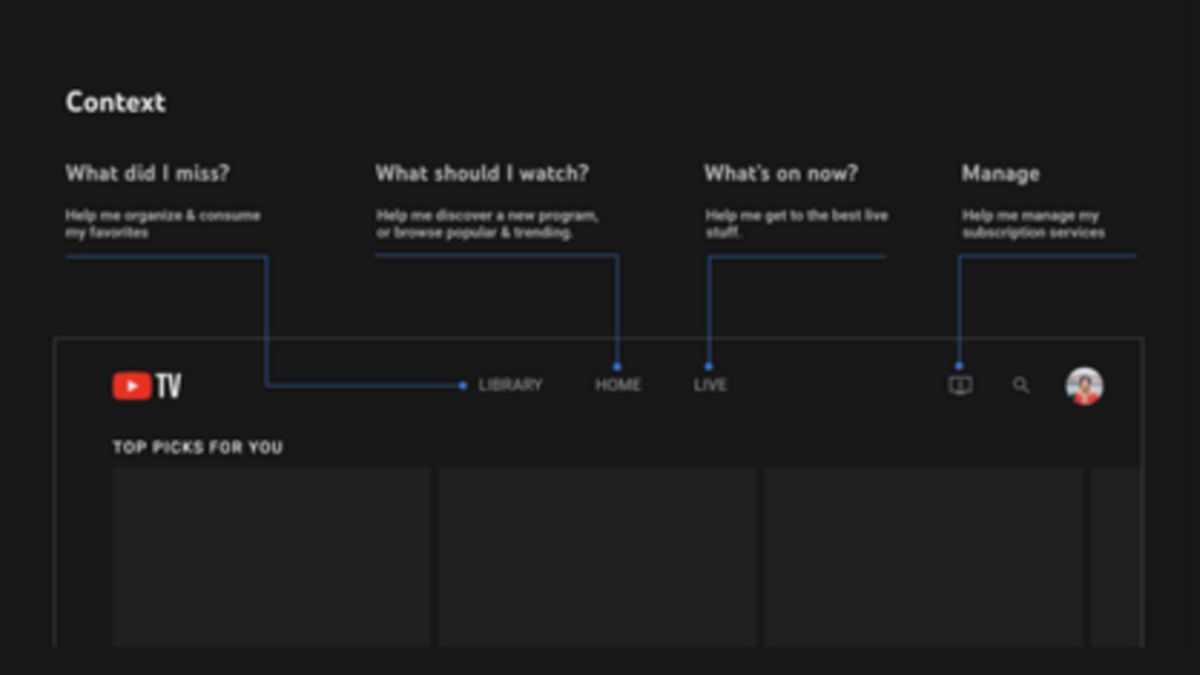
This YouTube TV Library update will help you manage your content with improved content filtering and better organization tools to make your library less cluttered. Users will start seeing this redesign in the next few months.
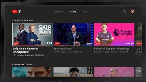
On the other hand, updates to the updated Live Guide now include a row of curated recommendations at the top, a denser grid showing more channels and programs on screen, and a simpler overall design. Users will also get more information about each live show or movie from the new guide.
This more compact update is primarily so that viewers can scroll less and receive information more quickly.
VOIR éGALEMENT:
"These changes reflect our mission to deliver fun, easy-to-use and modern TV experiences," wrote Esther Ahn, head of design for YouTube TV and the Primetime Channel, in a blog post.
Rather than focusing on one big launch, YouTube is working to integrate their principles across all major surfaces (Live, Library) and refine the user journey (Collecting, Browsing, Viewing).
"YouTube TV aims to provide fresh, intuitive updates to our entire experience with minimal disruption to our viewers," added Ahn.
Finally, Google stated that even more changes are under way, including bringing more flexibility and interactivity during live playback and making it easier to switch between user profiles.
The English, Chinese, Japanese, Arabic, and French versions are automatically generated by the AI. So there may still be inaccuracies in translating, please always see Indonesian as our main language. (system supported by DigitalSiber.id)
