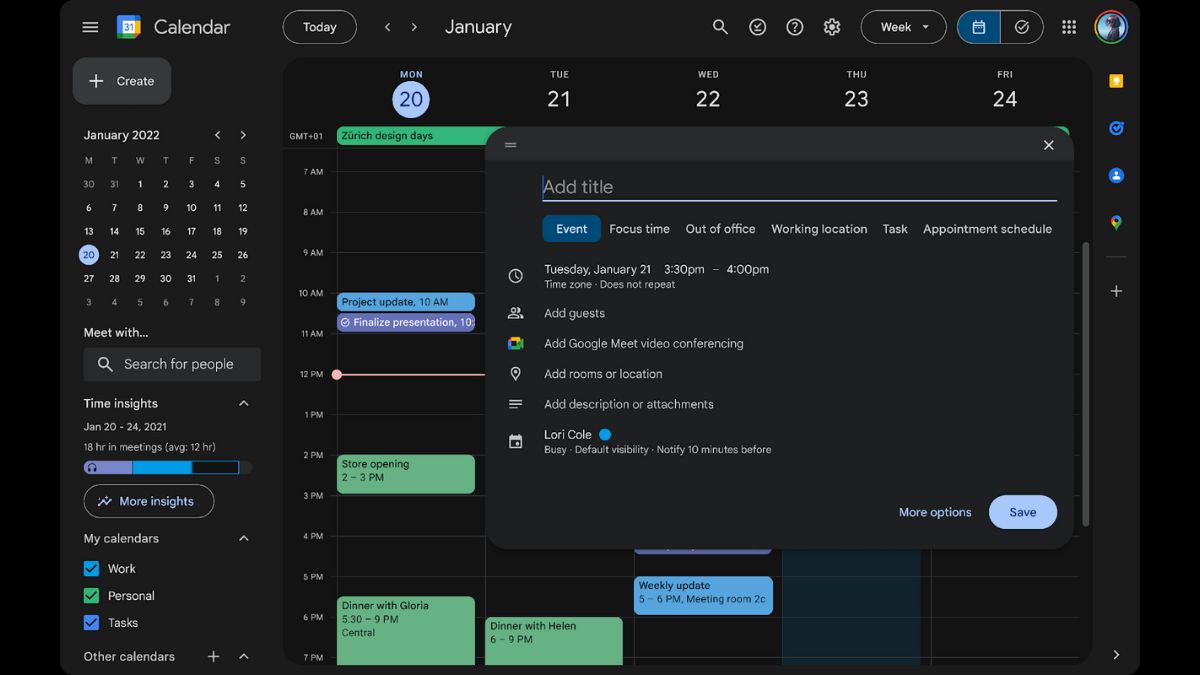


JAKARTA Not everyone likes the appearance of the website in bright mode because of its brightness. Google is aware of this problem so they provide a new feel for the Calendar website.
This time and date management platform gets a new interface that matches Google's Material Design 3. In addition to adding dark mode, the Calendar website will also accept changes in terms of control, typography, and iconography.
"We introduce the ability to switch between bright mode, dark mode, or device default theme options. This will give you a more convenient and customizable viewing experience, and can reduce battery usage," Google said.
To convert the Google Calendar website to dark mode, users can open the settings icon in the upper right corner, then click the Display menu. After that, select one of the desired modes, there is Light, Dark, and Default Devices.
SEE ALSO:
-
 | TEKNOLOGI
Dukung Startup di Asia Tech Conference, Danamon Sediakan Dana Investasi Rp1,5 Triliun
24 Oktober 2024, 17:05 -
 | TEKNOLOGI
Jelang Peluncuran Token TOMA, Pengguna Tomarket Tembus 40 Juta Pemain
24 Oktober 2024, 18:10 -
 | TEKNOLOGI
LEGO Horizon Adventures Sudah Gone Gold, Siap Dirilis pada 14 November
24 Oktober 2024, 19:30 -
 | TEKNOLOGI
Koin Meme AI Naik Daun dengan Market Cap Rp29 Triliun, GOAT dan TURBO Makin Moncer
24 Oktober 2024, 20:05
Meanwhile, for the control section, users will see buttons, dialogues, and sidebars that are made more modern and accessible. The typography at the interface has also been updated using letters specifically designed by Google.
Hopefully, this typography can be read easily. Finally, Google has also changed its iconography with a newer feel so that users can see it more clearly. All these updates started rolling out on October 23.
As usual, a quick release will take fifteen days. However, for scheduled releases, Google will start on December 2. All Google Workspace users, Individual Workspace, and personal Google accounts will get access to this new view.
The English, Chinese, Japanese, Arabic, and French versions are automatically generated by the AI. So there may still be inaccuracies in translating, please always see Indonesian as our main language. (system supported by DigitalSiber.id)
Most Popular Tags
#Prabowo Subianto #donald trump #2026 World Cup #venezuela #konflik timur tengahPopular


