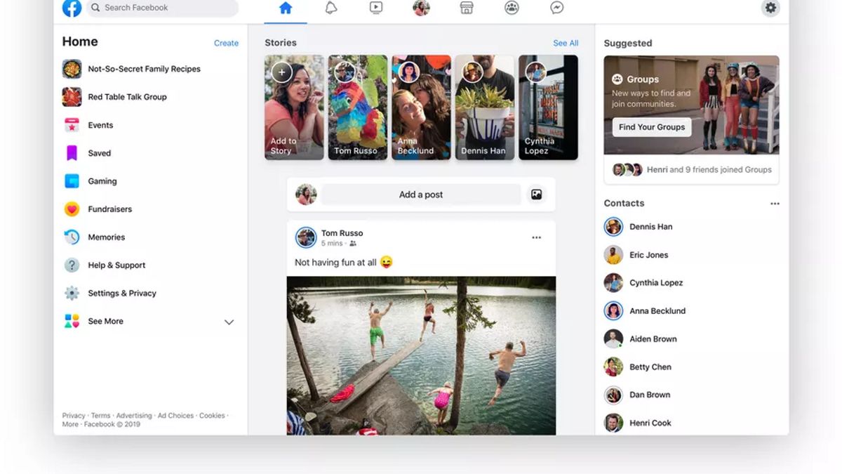
JAKARTA - Facebook has refreshed the appearance of its website, with a new layout design that is fresher and simpler. To be maximal, Facebook asks its users to leave their old view and switch to a new page.
Launching The Verge, Facebook users can choose the appearance of their website with a classic or new design. But slowly, Facebook is forcing its users to migrate to new designs.
Because, Facebook will end support for the appearance of its classic website, next September. That means, users will no longer get the Facebook home page with the distinctive blue color in its navigation section.
"The classic Facebook view will no longer be available in September. Before that, we hope you can tell us how we can continue to make Facebook better for everyone," wrote Facebook in its update notification, Monday, August 24.

In fact, Facebook has been rolling out a new look for the desktop or web version of Facebook, since March 2020. This new interface design includes a cleaner display with lots of white space, as well as dark mode.
Functionally, the new look also features a greater focus on the Groups service feature, as well as prominently displaying links to the Facebook Watch, Marketplace and Gaming sections of the top navigation bar. This design also rearranges the menu arrangement on the left side of Facebook or what is commonly called the sidebar.
This interface update is also rolled out evenly for the version of the Facebook application on iOS and Android. Facebook claims this new look, has a faster and more stable response.
The English, Chinese, Japanese, Arabic, and French versions are automatically generated by the AI. So there may still be inaccuracies in translating, please always see Indonesian as our main language. (system supported by DigitalSiber.id)


