JAKARTA - The designer for the production of the Marvel Loki series, Kasra Farahani, revealed a number of references and inspirations behind the grandeur and unique visual aesthetic for the series. This is not the first time Farahani has worked on a project for the Marvel Cinematic Universe (MCU). Previously, he was involved in "Guardians of the Galaxy 2" (2017), "Black Panther" (2018), and "Captain Marvel" (2019).
When asked if working on a series further limits his creative space, he said there is no significant difference between working on a serial project and an MCU film.
"This series is very fun and unique because it is on a different timeline from the MCU films we are familiar with. There are many stories that can be explored. However, it feels almost the same as working on an MCU film. About our creative ambitions, schedule, and creative process", he said.
Here are 3 facts behind the magnificent and unique visuals of the Loki series.

1. The Idea Comes While Reading Loki's Script
Farahani said the inspiration came after he read the script for "Loki" with director Kate Herron and executive producer Kevin Wright. All three have the same pop culture reference to be later adapted into a visual form.
"When I was sent the initial material for my interview, I was amazed by the breadth and variety of the incredibly interesting world in which the story takes place. (Through the script), It became clear very quickly that our references were very much in sync. We drew from the same popular culture points and the same type of visual", said Farahani, quoted from ANTARA, Wednesday, July 14.
2. Inspired by Mad Men (2007) and Blade Runner (1982)

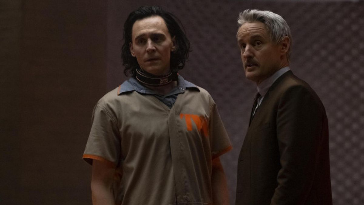
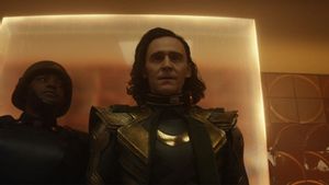
The most challenging as well as the fun thing for him was wrestling with the visual design of "Loki" was when he was working on the design for Time Variance Authority (TVA). The descriptions in the script helped him determine the visual aesthetic, which was heavily inspired by "Mad Men" (2007) and "Blade Runner" (1982).
"TVA, basically 'Mad Men' meets 'Blade Runner'. It expands beyond that to include more anachronistic references. This is where Terry Gilliam's work becomes a very important source of research for us. He, especially in his film 'Brazil' (1985), has the extraordinary quality of combining elements of the future and elements of the past, as well as elements of the present that are inaccurate but somehow feel real".
3. Combining Modern Architecture and Building Design
Visually, Farahani added that TVA was also inspired by the design of buildings and post-war medieval modern architecture and medieval modern institutional architecture.
Talking about the early production design process for Loki, he said the script was key for him, plus the presence of Loki himself -- Tom Hiddleston -- who also serves as executive producer -- helped him and the team a lot to get to know the characters and the environmental surroundings.
"It's very interesting to see Tom, who has played this character for 10 years, with us. He is like a 'professor' to Loki. He knows this character better than anyone. Tom helped us a lot in the art and design department, providing illustrations and stories. about his character", said Farahani.
"The script also offers a kind of great guide, in terms of what the different worlds have to achieve from a story point of view, the emotions of their feelings. Our job then translates them into images and worlds where these characters can move and have these emotional experiences", he added.
SEE ALSO:
The English, Chinese, Japanese, Arabic, and French versions are automatically generated by the AI. So there may still be inaccuracies in translating, please always see Indonesian as our main language. (system supported by DigitalSiber.id)
