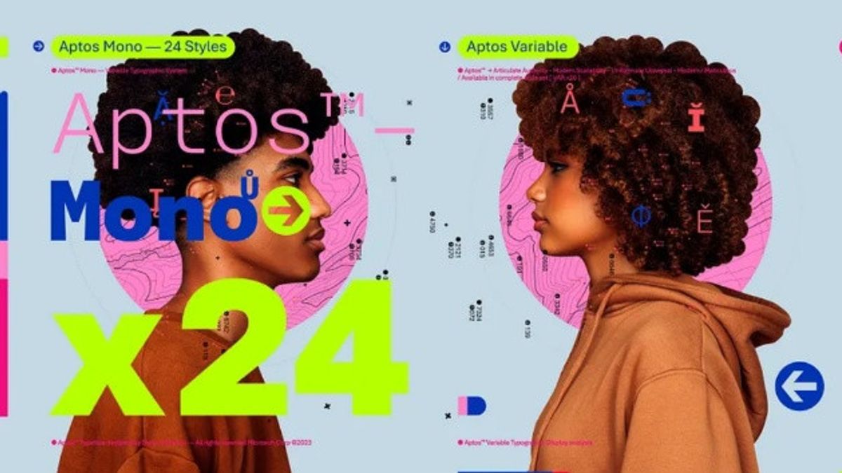


JAKARTA - Microsoft has started to change the font in its Office application to be more modern after 15 years, Calibri's default font has been changed to Aptos.
In 2021, the company will begin presenting five font options to replace the outdated Calibri as the default font.
Then, Microsoft collected feedback from his client. Apparently, Aptos is the favorite and will now be the default font for his productivity application.
The Office application itself consists of Word, Outlook, PowerPoint, and Excel. Aptos was created by Steve Matteson, one of the world's leading letter designers. He previously created Segoe, which Microsoft licensed to use as Windows default font.
"Similar to 20th-century Swiss typography, Aptos is a series of Sans. Also referred to as Grotesque or Gotik, serif Sans often have simple letters, even graffiti, and are easy to read," Microsoft said in its official blog, quoted Friday, July 14.
اقرأ أيضا:
-
 | TEKNOLOGI
Saham Alphabet Melonjak 4.9% Setelah Peluncuran Bard di Eropa dan Brasil
14 Juli 2023, 12:09 -
 | TEKNOLOGI
Twitter Gugat Empat Entitas Tak Dikenal di Texas Terkait Penambangan Data
14 Juli 2023, 11:01


"Aptos, made of various geometric, thick, well defined, direct, and constrained forms. It articulates many different languages and tones. The ends of the rods are cleanly cut. The smooth circular boxes inside the letters contours allow for higher reading, especially at small sizes," he added.
Although Aptos will replace Calibri as the default, Calibri will still be embedded previously at the top of the new font menu (only available on the web) with its predecessors, Times New Roman and Arial.
The other four fonts that were not selected as defaults, such as Grandview, Seaford, Badminton, and Tenorite will still be available at the Office. In fact, Microsoft stores the name of the Bierstadt font in drop-down voters so that users can use it.
The English, Chinese, Japanese, Arabic, and French versions are automatically generated by the AI. So there may still be inaccuracies in translating, please always see Indonesian as our main language. (system supported by DigitalSiber.id)