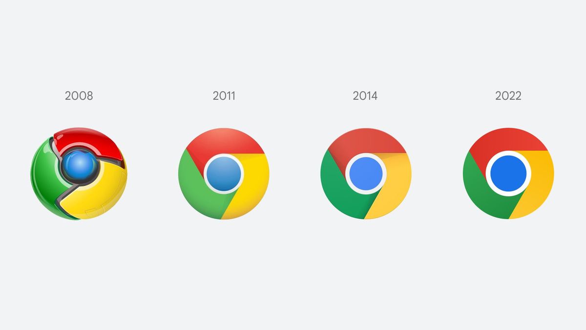


JAKARTA - After eight years, for the first time, Google's Chrome browser has finally changed its logo. Even if it looks the same, you should pay close attention to what has changed from it.
It can be difficult to spot the difference between the old and new logos. Luckily, a Google Chrome designer, Elvin Hu via a thread on his Twitter explaining what Google changed and why it happened.
Basically, this change only sharpens the colors found in the Chrome logo, namely red, yellow, and green. The blue circle in the middle seems to be bigger and deeper. The colors in the logo do look more lively because maybe the design team removed the shadows, but there are changes that Hu describes.
Some of you might have noticed a new icon in Chrome’s Canary update today. Yes! we’re refreshing Chrome’s brand icons for the first time in 8 years. The new icons will start to appear across your devices soon. pic.twitter.com/aaaRRzFLI1
— Elvin 🌈 (@elvin_not_11) February 4, 2022
Apparently, Google's design team placed certain shades of green and red next to each other creating an unpleasant color vibe. To fix this and make the icons more accessible, they decided to use a very subtle gradient, to prevent any color vibrations.
In changing this logo, Google reasoned that it wanted to customize the icons for various platforms such as Windows, macOS, Chrome OS, and others.
"We wanted the icons to feel like Chrome that was recognizable. But also well-crafted for each OS," said Hu.
The main Chrome logo that you click on from the dock/taskbar to access the web won't look the same on all systems either.
VOIR éGALEMENT:
-
 | TEKNOLOGI
Mengenal Apa Itu CryptoPunk, NFT Tertua yang Dihargai Ratusan Miliar Rupiah
05 Februari 2022, 07:36 -
 | TEKNOLOGI
Fortnite Datangkan Karakter Bruno Mars dan Anderson .Paak dalam Gim
05 Februari 2022, 04:05 -
 | TEKNOLOGI
Mengenal Decentraland, Metaverse Paling Populer dan Cara Memainkannya
05 Februari 2022, 06:25

Cited from The Verge, Monday, February 7, on ChromeOS, the logo will look more colorful to complement the other system icons, whereas on macOS, the logo will have a small shadow, making it look like it popped out of the dock. While the Windows 10 and 11 versions have a more dramatic gradient so they match the other Windows icon styles.
Users will start seeing this new icon if they are using Chrome Canary (the developer version of Chrome), but it will start rolling out to everyone over the next few months.
There are also several new icons for the beta and developer Chrome logos, with the most dramatic change being the blueprint style icons for beta apps on iOS.
Hu also noted that the design team experimented with white lines that serve as borders between each color, but this makes the overall icon smaller, potentially making it harder to spot among other Google apps.
The English, Chinese, Japanese, Arabic, and French versions are automatically generated by the AI. So there may still be inaccuracies in translating, please always see Indonesian as our main language. (system supported by DigitalSiber.id)