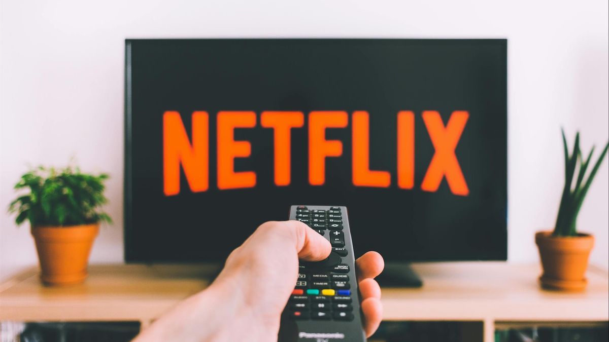


JAKARTA Netflix stated that a number of users like its latest interface (UI) on television. However, the opposite can actually be seen on various social media, especially Reddit.
This latest version of the app display was tested before it was widely launched in March. In fact, the test took up to one year. However, the public's response over the past two months has not changed in a positive direction.
In fact, there are many who criticize the television version of UI Netflix. Reporting from Android Police, this happens because Netflix makes its television UI similar to a UI tablet, which makes people annoyed when they want to search for recommendation content easily.
Users now have to scroll twice as much just to view information equivalent to the old UI. In addition, the sidebar, which is usually easily accessible, has now been moved to the top.
Basically, Netflix's latest UI confused its users because it was very different from the old look. Therefore, not a few who hate the UI and voice their disappointment on Reddit.
SEE ALSO:


However, Netflix stated the opposite. The company says that it finds more users who like the latest look than the old one. Therefore, they retain their latest designs.
"With a larger box (content), we're showing more information at the start to help you make better decisions. Instead of looking at 20 or 30 titles at once, now you're looking at some quick information," a Netflix spokesperson said, quoted via Hollywood Reporter, on Monday, June 16.
Netflix also realizes that many users are disappointed with its latest television UI. However, this new format is believed to make it easier for users to access detailed information before watching movies or series on the platform.
The English, Chinese, Japanese, Arabic, and French versions are automatically generated by the AI. So there may still be inaccuracies in translating, please always see Indonesian as our main language. (system supported by DigitalSiber.id)


