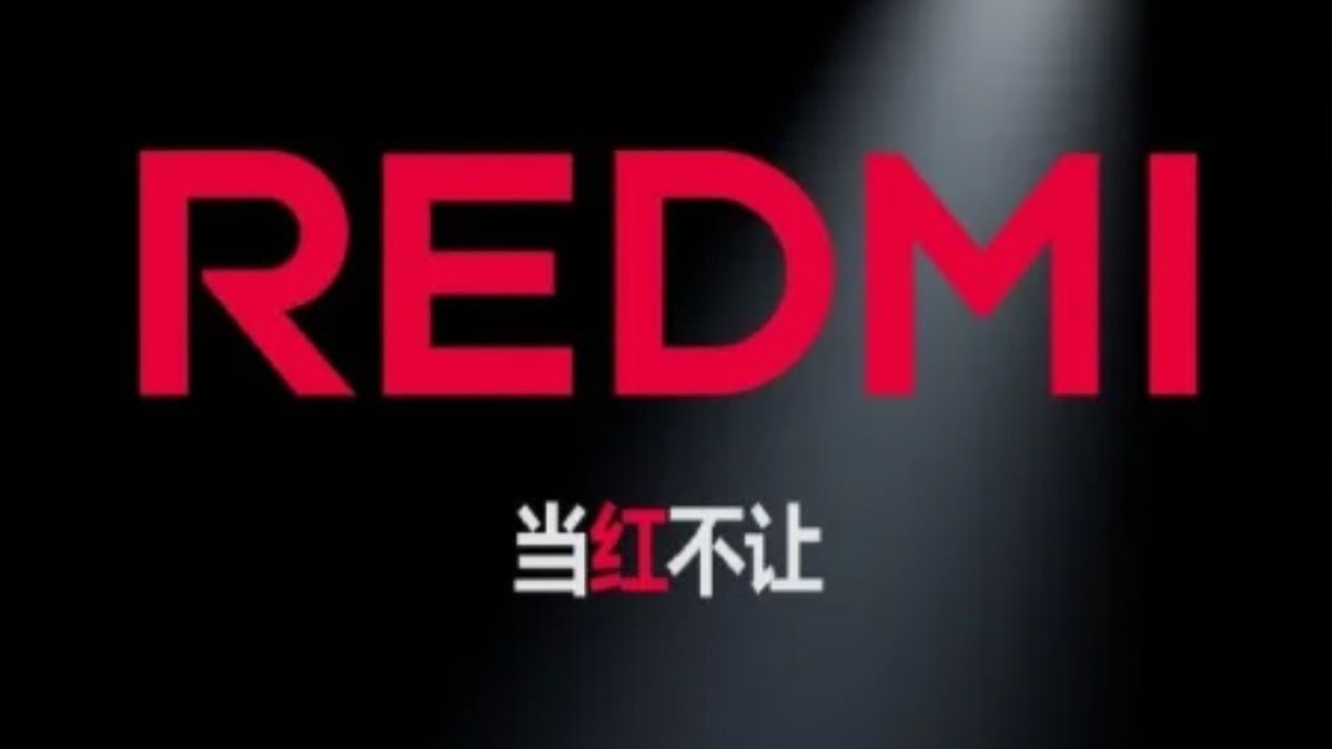
JAKARTA Redmi, a sub-brand from Xiaomi, got the latest logo design on Thursday, November 21. This logo change was delivered directly by Lu Weibing, President Mobile Phone Xiaomi, via Weibo.
Previously, the Redmi logo was written capital in the first letter, while the rest used lower letters. The color of the Redmi logo is also not much different from Xiaomi, which is the combination of white and orange in the background.
Now, Xiaomi has officially changed the color and writing of the Redmi logo. If previously Redmi was written with a combination of capital and small letters, now all of its letters are written in capital, similar to POCO, which was previously known as the Xiaomi sub-brand.
Xiaomi also uses red so that the logo looks more striking. Lu said that this enormous change was not made solely for aesthetic purposes, but also related to Redmi's strategy going forward.
SEE ALSO:
"Redmi changed her name from REDMI," Lu said in his post, citing from Gizmochina. And there is a lot of strategic thinking behind it." It is not explained what kind of strategic thinking underlies this change.
However, Lu said that this change was in line with Redmi's success in various market segments. With this new logo, Redmi will focus on presenting products with the best configurations in the future.
"As Xiaomi is increasingly successful in high-end brands, Xiaomi will enter a higher price segment with more advanced technology, giving Redmi greater room to rise," Lu explained.
The English, Chinese, Japanese, Arabic, and French versions are automatically generated by the AI. So there may still be inaccuracies in translating, please always see Indonesian as our main language. (system supported by DigitalSiber.id)


