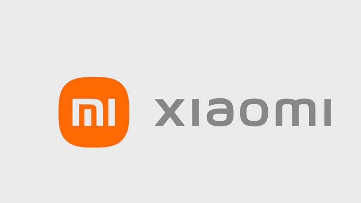


JAKARTA - The tech giant Xiaomi is changing their old logo with a new design. The new logo was introduced by the boss of Xiaomi, Lei Jun at an event for the release of his newest foldable smartphone, Mi Mix Fold, on Tuesday 30 March.
Previously, the Xiaomi logo was in the form of a box, while the new logo comes with a fresh appearance in the form of a squircle or square, but each side is curved.
Meanwhile, the MI writing did not get any changes. It seems that the company wants to maintain the originality of the writing that was written the first time. So they only change the shape of the square.
Lei Jun uploaded the new Xiaomi logo via his Twitter post. The new Xiaomi logo was designed by Kenya Hara, a graphic designer from Japan. Lei Jun commented on the new logo, according to him, the logo represents the current state of Xiaomi.
He also questioned whether Xiaomi fans or Mi Fans were disappointed or not because the Xiaomi logo was not completely overhauled. Also because the logo has only been changed so it has curved sides.
"Are you disappointed with this logo, that we only rounded off the edges of the original logo?", said Lei Jun.
SEE ALSO:

"(The new logo) also changes our internal spirit and also our brand mentality", said Lei Jun as quoted by The Verge, Wednesday, March 31.
Kenya Hara, as the designer of the logo, revealed that the new Xiaomi logo is a reflection of the philosophical concept of "life".
The Xiaomi boss interprets the concept of "life" in the new Xiaomi logo by himself. He revealed that technology must be able to meet the needs of human life.
"People live, therefore, technology as an invention must also live", he said.
The English, Chinese, Japanese, Arabic, and French versions are automatically generated by the AI. So there may still be inaccuracies in translating, please always see Indonesian as our main language. (system supported by DigitalSiber.id)
Most Popular Tags
#Prabowo Subianto #donald trump #2026 World Cup #venezuela #Bhayangkara hut #konflik timur tengahPopular


