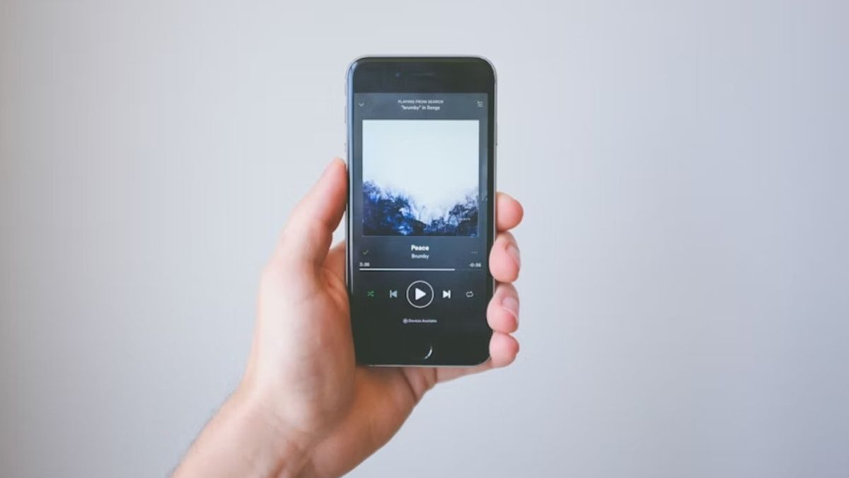
JAKARTA YouTube Music launched a new design for the background or background on the Now Playing page. This update was originally only available for Android devices, but has now been launched on iOS. Before it was updated, the Now Playing page on the iPhone only displays a solid color or one color based on the album's currently playing cover. However, now the background design uses a gradient effect or a pairing of several colors. Reporting from 9to5google, YouTube Music still displays a background based on the cover of its music album, only a few colors are combined. At the top of the color used is brighter, while at the bottom it is much darker. YouTube Music users may not realize the color blending due to the gradient effect used is very subtle. If you look at the details, the top and bottom of the background do display a different color. Apart from changing the color on the background, updates from YouTube Music do not highlight the buttons for Next, Lyrics, and Related. Previously, these buttons had different backgrounds, but now their colors are combined with the Now Playing background. By redesigning the Now Playing background, YouTube Music users will see the scrub and carousel buttons more prominently. In addition, the colors are much more convenient to see than the solid colors used previously. The launch of the gradient effect in the Now Playing background was launched in version 7.01 for the iPhone and also the iPad. You need to update the application to see the update or wait until its update reaches your phone.
The English, Chinese, Japanese, Arabic, and French versions are automatically generated by the AI. So there may still be inaccuracies in translating, please always see Indonesian as our main language. (system supported by DigitalSiber.id)


