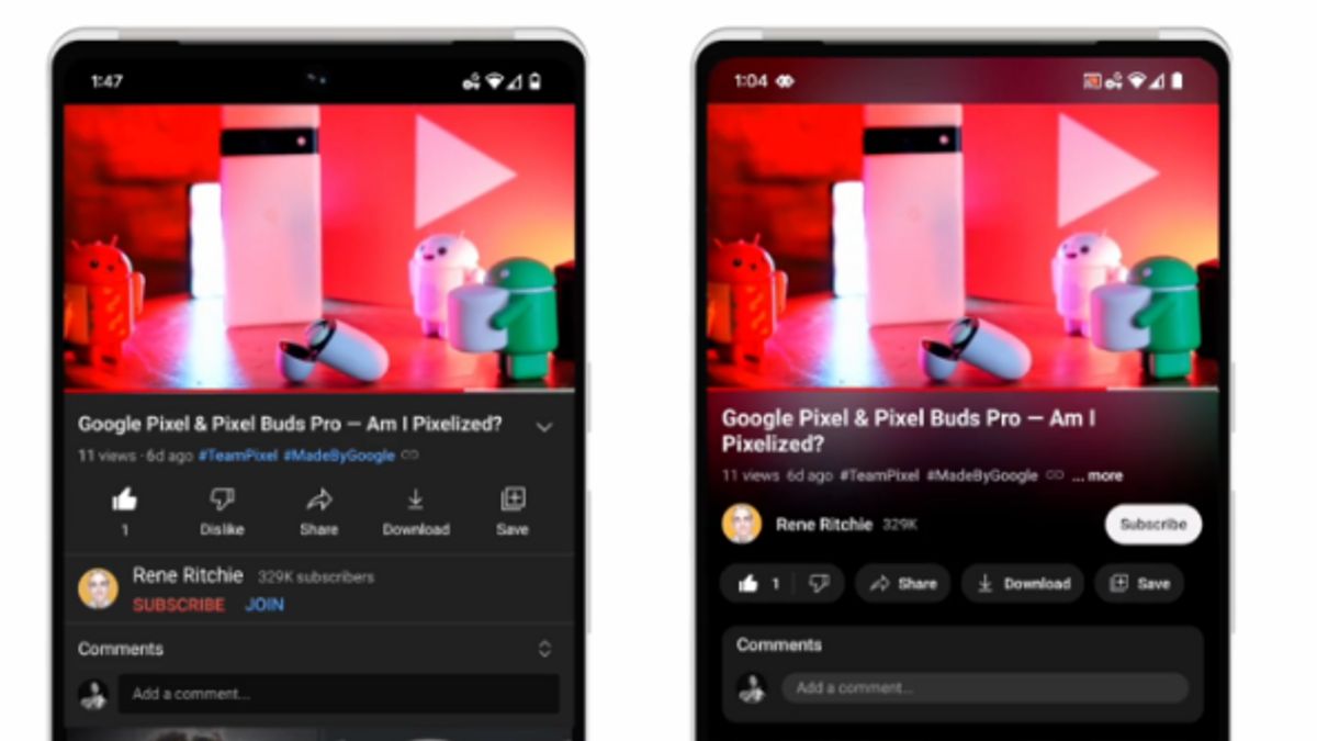
JAKARTA - Changes in YouTube interfaces launched today, the new look includes precision search options, ambient modes, new buttons, dark mode and the most awaited features of pinch-to-zoom.
With the presence of a new search option, users can easily find the right part in a video they want to watch. This feature is available to desktop and mobile users, they can scroll up on videos to view a row of mini images.
There is also a new color effect called ambient mode, which uses dynamic color sampling to match the background color of the application with the color in the video that the user watches.
"For our understanding, new effects are very subtle and especially for aesthetic reasons. The goal is to attract viewers into content and put a bigger focus on our viewing page," YouTube UX Director Nate Koechley.
Furthermore, standby mode will also be available on video playlists. Users will see standby modes on web and mobile viewing pages when dark mode is enabled. After that, the dark mode will soon appear darker on the web, mobile, and Smart TV.
Launching TechCrunch, October 25, another visual change is the new button under the video. The YouTube link in the video description is now a button to make it more comfortable to see. Likes, shares, and downloads will also be changed for smaller sizes.
Likewise, the subscription button aka subscribe will now appear as a black-and-white pill-shaped button with the words "subscribe", not bright red.
Lastly is the most eagerly awaited feature, new pinch-to-zoom. This feature can be used by users on iOS and Android devices to enlarge videos so they can see more details.
Previously, this feature was only available as a trial for Premium subscribers last August, and will now be available to everyone.
The English, Chinese, Japanese, Arabic, and French versions are automatically generated by the AI. So there may still be inaccuracies in translating, please always see Indonesian as our main language. (system supported by DigitalSiber.id)


