

JAKARTA - Twitter introduced the new icon on its platform last Saturday via a thread shared on Twitter @TwitterDesign.
"The goal is to create a cohesive icon set that is bold in form and style that is still acceptable and cheeky where possible," the social media platform wrote.
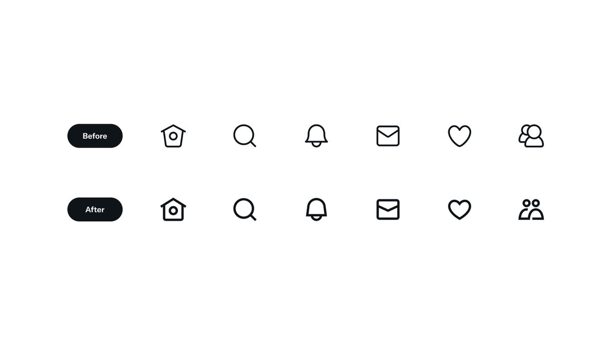
Twitter also shared some views showing the difference between the old and new icons.
The goal was to create a cohesive set of icons that are bold in shape and style yet still relatable and a little cheeky where possible. pic.twitter.com/vXphgv4pCK
— Twitter Design (@TwitterDesign) October 21, 2022
Based on what VOI saw from the post, the overall icon shape hasn't changed much. However, what makes this distinction obvious is the thickening of the lines.
"We strive to make our icons simple, straight forward and inclusive for any culture and market," Twitter wrote in a caption for the new icon.
The plan, Twitter will soon launch its new icon to all users on the web, iOS, and Android in the coming days, said spokesman Shaokyi Amdo in an email to The Verge.
SEE ALSO:
-
 | TEKNOLOGI
Curiosity Berhasil Capai Wilayah Tujuannya di Mars Setelah 10 Tahun
22 Oktober 2022, 06:03 -
 | TEKNOLOGI
Dukung FIFA, Hyundai Resmi Jadi Sponsor dan Sediakan Bus Listrik untuk Atlet
22 Oktober 2022, 06:00 -
 | TEKNOLOGI
Digimon World: Next Order Siap Dirilis di PC dan Nintendo Februari Tahun Depan
22 Oktober 2022, 05:00


"We are constantly developing our icons to be in tune with technology. We are optimizing to be scalable in size and maintain readability for various uses and scenarios," he said.
Twitter says that this change follows a new visual design language introduced in August 2021, which includes the rollout of the Chirp font across apps.
The English, Chinese, Japanese, Arabic, and French versions are automatically generated by the AI. So there may still be inaccuracies in translating, please always see Indonesian as our main language. (system supported by DigitalSiber.id)
Popular


