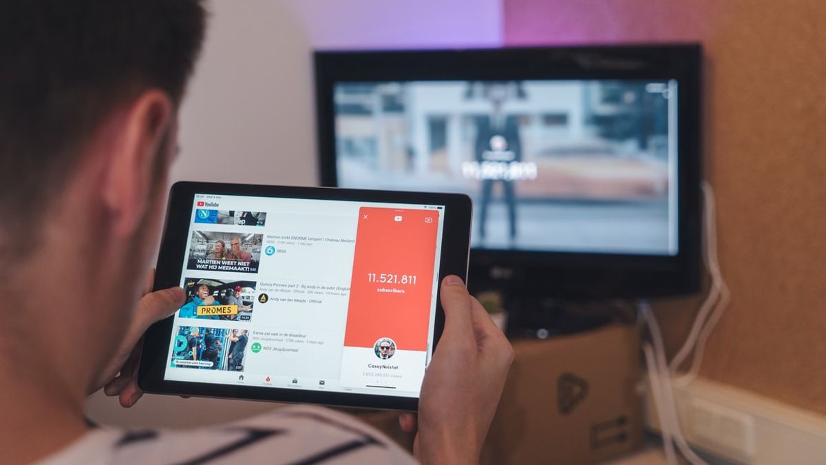
JAKARTA - YouTube has refreshed its platform, by changing the full-screen interface of its mobile application.
With this change, it's easier for users to comment on and share what they're watching by providing direct access to the button.
Previously, the old version of this interface hid most of these features behind a swipe up gesture in more videos, where the new version places it front and center, lowering the associated video to a button in the corner.
YouTube has a new Video Player UI on mobile devices now (being rolled out on both Android & iOS devices), with direct access to buttons like Like/Dislike, Sharing, and Comments. #YouTube pic.twitter.com/lbfVk8ksTu
— Ishan Agarwal (@ishanagarwal24) February 1, 2022
This change only appears when the user is watching in full screen or landscape, most apps look the same when watching videos in portrait mode.
Launching CNET, Thursday, February 3, in that display, YouTube pinned buttons like, dislike, share, add videos to playlists and view comments, all in full screen mode.
According to YouTube's head of product communications, Mariana de Felice, the update will start rolling out on Android and iOS devices this week for all global users.
Another feature of the new interface is that suggested videos are now stored in a collapsible box. The dislike button no longer shows how many people pressed it, following a change YouTube started testing last year.
Earlier this month, YouTube CEO Susan Wojcicki said the public dislike counter is often misused, meaning it doesn't always show an accurate way to select videos to watch.
The English, Chinese, Japanese, Arabic, and French versions are automatically generated by the AI. So there may still be inaccuracies in translating, please always see Indonesian as our main language. (system supported by DigitalSiber.id)


