


JAKARTA - Each living room is a stage for style and comfort. Elements as small as a curtain can change the room's expression from elegant to awkward. Unfortunately, in an effort to dress the window, many people unknowingly trap themselves in a choice that makes the room look cheap.
Based on the review of interior designers quoted from The Spruce page, Thursday, September 25, the following is VOI peels six of the most frequent mistakes in choosing and installing curtains, complete by avoiding them so that residences look luxurious and classy.
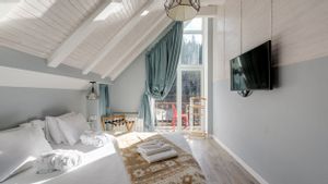
Elana fragson said that the curtain that only towered a few inches above the floor actually looked like an "cheap mistake" rather than an aesthetic choice. Ideally, the curtain should touch the floor or even sweep the floor a little bit. Because too long it can still be shortened, while too short there is no solution.
Vertical blinds or vertical plastic curtains are referred to as the cause of instants of the room feeling 'cheapy'. The sound of shaking from the plastic blades and the appearance that is synonymous with a standard clinic or apartment is a strong reason to avoid it. If your space wants to have a more personal and friendly impression, choose a warmer and softer cloth curtain or sliding panel in your eyes.
Allay Prall emphasized that the process of ironing the curtain before hanging it is very important because wrinkles and sharp folds weaken the character of the room. This is because hanging curtains in a tangled state will create a careless and half-finished impression, even though the ingredients and motifs may already be attractive.
SEE ALSO:
-
 | LIFESTYLE
Fenomena Unik, Ini Alasan Jendela Rumah di Belanda Tak Pernah Pakai Tirai
11 September 2025, 21:55 -
 | LIFESTYLE
5 Kesalahan Dekorasi Umum yang Dapat Membuat Rumah Terasa Kurang Menarik, Menurut Desainer
24 September 2025, 20:48 -
| LIFESTYLE
Fenomena Unik, Ini Alasan Jendela Rumah di Belanda Tak Pernah Pakai Tirai
11 September 2025, 21:55 -
 | LIFESTYLE
Kenapa Bangunan Zaman Belanda Terasa Dingin? Ternyata Ini Alasannya
28 Oktober 2024, 21:55

Curtains should not be hung right above the windowsill frame. According to Orbitson and Prall, the too low handle position makes the windows appear shorter and compressive
An eleganter strategy:
Eve Jean reminded her not to choose a curtain with an overlapping or pattern that is too crowded, because it actually disrupts visual balance and looks cheap. On the other hand, fabrics such as linen, cotton, or cotton with a fine texture and solid color or a simple pattern are much safer and elegant. Especially when synergized with space decorations.
Valance or decoration curtain above the window, used to be popular, but now it's considered outdated. Jean said that heavy valance not only loads the window's appearance but also blocks natural light, so the room feels gloomy and seems old-school. It's better to ignore total valance or choose a very light and minimalist version if you really want it.
By understanding and avoiding mistakes such errors, you can change the curtain from just a functional complement to a design element that strengthens the character of the space.
The English, Chinese, Japanese, Arabic, and French versions are automatically generated by the AI. So there may still be inaccuracies in translating, please always see Indonesian as our main language. (system supported by DigitalSiber.id)


