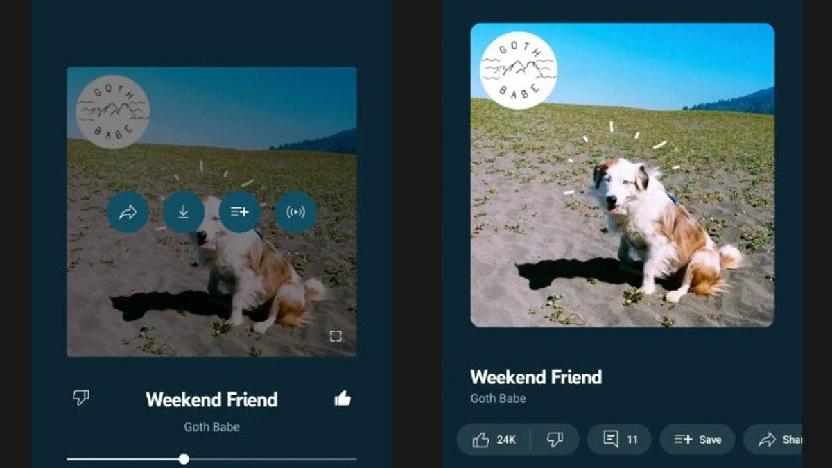
JAKARTA - YouTube Music has just received the most controversial feature, namely comments on the redesigned Now Playing screen, where listeners can give their response to the song they hear.
In the main YouTube application, the comments column is not the most harmonious place of all time and there is no good reason to integrate it, where musicians will get bad comments.
In the Now Playing tab section, listeners will be able to read and add their own comments to respond to the song.
According to reports, the appearance of the comments column on YouTube Music is exactly like the main application. The feature, which was tested last June, has shown User Interface (UI) changes, rolled out widely on Android and iOS.
The album cover now looks bigger than ever, but is at the top to provide space for horizontally formed carousel buttons between the artist's name and the search bar.
In the carousel tab, there are buttons for Suka, Not Like, Add Comments, Save, Share and Download the track, or switch to Radio. Previously, many of these options only appeared when the partner knocked on the album cover.
اقرأ أيضا:
However, listeners can still tap the album cover to display a full screen with icons appearing in the lower right corner.
With a new set of controls on the Now Playing screen, YouTube Music is increasingly resembling the main YouTube app and superior to its competitors, Spotify, Apple Music and others.
YouTube Music also has smaller UI changes such as white Play or Jeda buttons and music or video diversions at the top, which previously used the Material You dynamic themes, as quoted from Android Police and 9to5Google, Friday, September 1.
The English, Chinese, Japanese, Arabic, and French versions are automatically generated by the AI. So there may still be inaccuracies in translating, please always see Indonesian as our main language. (system supported by DigitalSiber.id)


