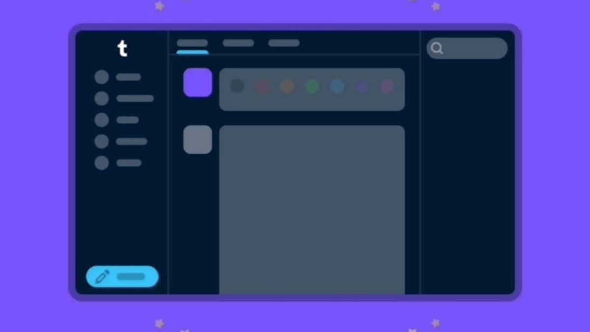
JAKARTA - After testing with certain users over the past month, Tumblr has finally officially launched its new interface for the web browser version.
"Now, after some extensive adjustments, we are starting to roll out this new dashboard navigation to everyone who uses a web browser," the company wrote in an announcement on its official blog quoted Friday, August 18.
The company revealed that the reason behind the changes to its interface on this web is to make it easier for users to understand and explore what is happening in Tumblr, whether they are new or old users.
This change includes a sub-page setting (Account, Dasbor, etc.) which is now on the right side of the settings page. Because previously users had to expand items that were on the navigation to the left.
Selain itu, Tumblr juga memperbaiki beberapa masalah dengan jendela pesan di layar dengan tampil yang lebih kecil, serta mengempiflasi bagian Account untuk membuatnya lebih mudah untuk sampai ke blog Anda.
اقرأ أيضا:
Furthermore, this platform is working on creating a foldable version of this navigation and improving the use of screen space for users with larger screens. The company says it is also working to increase access to accounts and sideblogs.
"We are looking to create a foldable version of this navigation and increase the use of screen space for you to be very large screens. We are also working to improve access to your account and sideblog," the company said.
According to data seen by TechCrunch from data.ai, Tumblr acquired 880,000 new installations across iOS and Android in November, up from 450,000 and 500,000 in September and October, respectively.
The English, Chinese, Japanese, Arabic, and French versions are automatically generated by the AI. So there may still be inaccuracies in translating, please always see Indonesian as our main language. (system supported by DigitalSiber.id)


