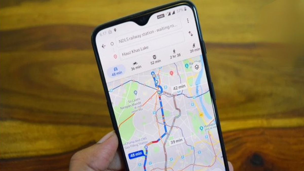


JAKARTA - Google Maps has just redesigned a small directional interface that is very often used, providing a clearer picture of the details of travel around the world.
Previously, Google Maps displayed an overview of the journey in three rows of solids, leaving a lot of empty space on the right. Now, the color-coded duration is separated into two rows on the left and much larger than ever before, thus highlighting the main information more.
The latest change is the display of "Tiba on hh:mm AM/PM" that comes along with travel details, such as the fastest Rute, albeit with regular congestion.
Old Vs New Comparison
On the last line, the travel distance is still clearly displayed, along with other travel details such as toll fees and time savings.
SEE ALSO:


This redesign is applied to all modes of transportation, with the previous display full of text now benefiting greatly from this change.
From the user's point of view, this approach feels lighter and uses the space at the bottom more efficiently, especially from the wide side.
This change is now being widely introduced through version 25.13.06 of Google Maps for Android, but not yet available on iOS.
The English, Chinese, Japanese, Arabic, and French versions are automatically generated by the AI. So there may still be inaccuracies in translating, please always see Indonesian as our main language. (system supported by DigitalSiber.id)
Most Popular Tags
#Prabowo Subianto #donald trump #2026 World Cup #venezuela #konflik timur tengahPopular


