JAKARTA Google often makes changes to User Interface (UI) YouTube by launching new features. Some of them look useful so that there are minimal complaints, while the rest can be problematic.
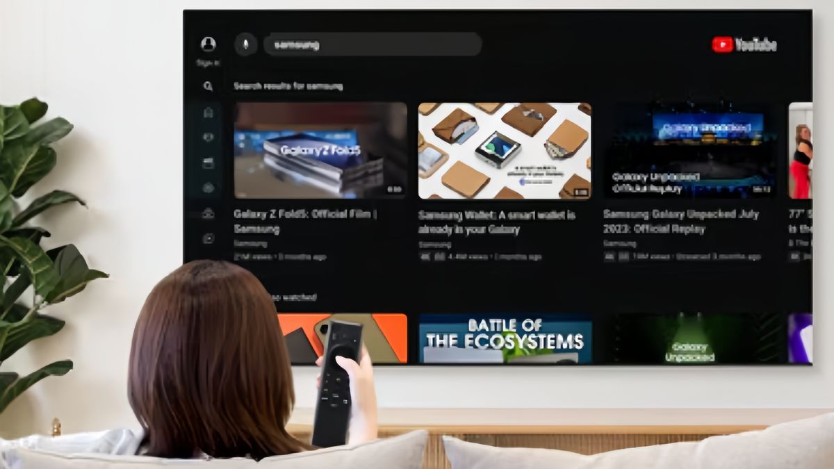
If the newly launched feature can lower the platform's performance or interfere with the user's experience, Google has made a mistake by creating a setback for the platform. Apparently, this is happening again in the YouTube app for television.
The Suka and Dislike Button in YouTube videos has the same appearance, both on mobile and television applications. These two buttons are always side by side and placed parallel to other features. However, Google recently changed its appearance.
Reporting from 9to5google, Google is seen combining Suka and Dislike signs in one button with the thumb icon facing up and down. If the buttons are knocked, the user will see a mini pop-up menu to select a Suka or Dislike sign.
SEE ALSO:
This change can be seen in several television models, such as Android TV and Chromecast with Google TV. It is not yet known whether this feature change is still in the testing phase or is being rolled out in stages to all television YouTube apps.
Overall, the function of this feature has not changed. However, the stages of leaving the Suka or Dislike sign are more complicated than before. Some users may complain about this change.
The reason is, navigation on television is not as good as on smartphones. While watching television, users have to press the button many times just to see the desired video. Therefore, this new change creates a setback for the YouTube platform.
The English, Chinese, Japanese, Arabic, and French versions are automatically generated by the AI. So there may still be inaccuracies in translating, please always see Indonesian as our main language. (system supported by DigitalSiber.id)


