

YOGYAKARTA - Understanding color theory for home interiors can be an important step if you want to create a decoration that feels comfortable and pleasing to the eye. Color is not only about aesthetics, but can also affect mood, lighting, to the impression of spaciousness in the room. Therefore, the selection of colors in interior design should not be done randomly. By understanding the basics of color theory, you can make your home feel more harmonious and have a strong character.
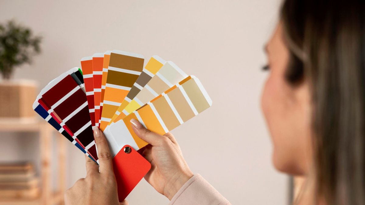
What is color theory in interior design?Color theory is a basic guide on how colors work and relate to each other. Quoting Homes and Gardens, Tuesday, May 19, in the world of interior and home decoration, color theory helps determine the combination of colors that feel balanced and visually appealing. This concept usually uses a color wheel or color wheel to understand the relationship between colors. From there, designers can choose the right colors to create a certain atmosphere in the room.
Color theory also helps avoid an interior that feels "crowded" or too flat. Sometimes a room looks uncomfortable not because of the furniture, but because the color combination is not in harmony. By understanding this basis, you can be more confident when choosing wall paint, sofa, carpet, to small decorations. The house also feels like it has a more complete "taste flow", not just a collection of beautiful items.
In color theory, there are three main groups that need to be understood first. Primary colors consist of red, blue, and yellow which are the basis of all other colors. Meanwhile, secondary colors are formed from the mixture of two primary colors, such as green, orange, and purple. Then there are tertiary colors that arise from the combination of primary and secondary colors.
Understanding this division makes it easier for you when you want to create a combination of interior colors for your home. For example, blue and green colors usually give a calm and fresh impression, suitable for bedrooms or workspaces. Conversely, red and orange colors feel warmer and energetic so they are often used in the dining room or gathering area. Each color carries a different "mood", like a playlist that changes the mood of a trip.
Warm and cold color differenceWarm colors usually include red, orange, yellow, and their derivatives. This type of color can make the room feel more alive, familiar, and comfortable. No wonder many living rooms or dining rooms use warm tones to feel more friendly. However, if used excessively, warm colors can also make the room feel full and visually tiring.
Conversely, cool colors such as blue, green, and purple are often chosen to create a calm and relaxed impression. Rooms with cool colors usually feel wider and more relaxing. Therefore, this color is popular for bedrooms, bathrooms, or relaxing areas. The combination of the two can also produce an interesting balance if combined properly.
One of the important concepts in interior color theory is understanding the color scheme. A monochrome scheme uses one color with different levels of light and dark so that it looks neat and elegant. There is also an analog scheme that uses colors that are adjacent to the color wheel, for example blue, bluish green, and green. The result usually feels soft and harmonious.
If you want a bolder look, you can try a complementary scheme. This scheme combines colors that are opposite on the color wheel, such as blue and orange or green and red. The combination creates a strong contrast and makes the room look more dynamic. The key is to maintain balance so that the colors do not "scream" at each other in one room.
The importance of lighting in choosing colorsPaint colors or decorations can look different depending on the lighting of the room. Natural light from the sun usually makes the colors look softer and more real. While yellow lighting can give a warm effect, while white lights make the colors look sharper. Therefore, it is important to try the color sample first before painting the entire room.
Many people are disappointed because the color of the paint they chose looks different after it is applied. This is actually quite normal because the color is very influenced by the light condition. A cream color, for example, can look warm during the day but change to a bit dull at night. Therefore, seeing the color at different times is a simple trick that interior designers often use.
Use neutral colors as a counterbalanceNeutral colors such as white, cream, gray, and brown often become a "bridge" in home decoration. These colors help balance the combination of stronger colors so that the room remains comfortable to look at. In addition, neutral colors are also more flexible when combined with various interior styles, ranging from minimalist to classic. No wonder many modern homes use a neutral color base.
Even though it looks safe, neutral colors still have different characters. Gray can feel modern and cold, while cream gives a warm and relaxed feel. You can also add texture through fabric, wood, or decorations so that the room doesn't feel too plain. That way, the interior of the house stays alive without having to be filled with many striking colors.
Understanding color theory for home interiors does not mean you have to follow the rules rigidly. Rather, color theory helps you recognize the combination that best suits the character and needs of the space. With the right color combination, home decoration can feel more harmonious, comfortable, and have a pleasant atmosphere to live in every day. In the end, color works like a silent language in interior design, quietly forming a sense of comfort from the first time you enter the room.
The English, Chinese, Japanese, Arabic, and French versions are automatically generated by the AI. So there may still be inaccuracies in translating, please always see Indonesian as our main language. (system supported by DigitalSiber.id)
Popular


