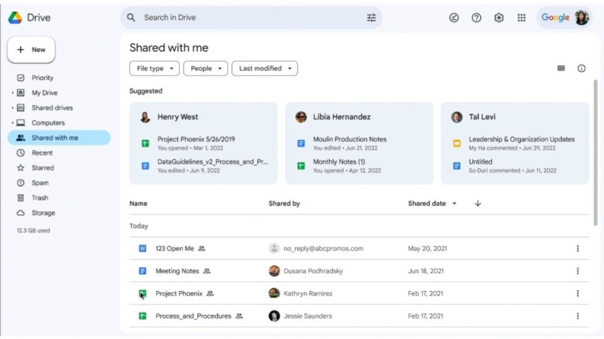
JAKARTA Google updated the Home page of the Drive website in November 2023. Now, the Home page is experiencing an increase with the search box and all the filters being moved.
Previously, search boxes were placed parallel to logos and icons such as settings to profiles. However, in the newly released update, the search box was moved slightly down. This makes the side side of the logo empty.
In addition to changing the layout of the search box, Google has also changed the position of the feature. Over the years, the search box was seen closing to the left. Now, the feature is just in the middle of the screen.
Search filters based on Types, People, Modifications, and Locations also change places. All of these dropdrown menus are still under the search box so that their position becomes in the middle. Suggestion filters do not change.
All of these updates have been rolled out to the Google Drive website for Individual Workspace, Workspace, and personal Google accounts. However, the launch is still being carried out in stages.
SEE ALSO:
This layout change will occur automatically, but users can disable the feature. If later you see changes from the layout and feel like it, you can change the appearance.
You just need to open Settings, then look for a menu to change the default initial page of Google Drive. When the feature is deactivated, the Home page display will return to the previous one.
The English, Chinese, Japanese, Arabic, and French versions are automatically generated by the AI. So there may still be inaccuracies in translating, please always see Indonesian as our main language. (system supported by DigitalSiber.id)


