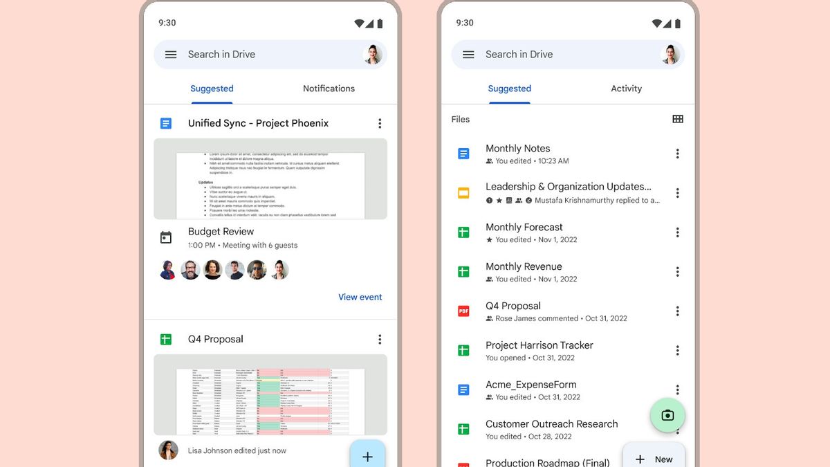
JAKARTA - Google is starting to roll out Drive home design on Android and iOS with a more compact UI to help you find the required files for a short time.
"We updated the Google Drive mobile app homepage on Android and iOS mobile devices to help you find the right files more easily," Google wrote in its update announcement.
Previously, on the Drive home page you would find two tabs, namely the Suggestions tab and Notifications. But, with this update, Google replaces the Notifications tab with the Activity tab.
According to Google, this updated view is recommended (sugested) will allow you to see more recommended files at once, such as files that have just been opened, shared, or edited.
While Activity tabs that are already on the web and are now on this phone will allow you to view items that require your attention such as requests for access waiting for the latest decisions, comments, and waiting for approval, all in one place.
SEE ALSO:
Drive's redesign launch on Android has been rolling out since November 6. However, according to VOI's monitoring, this update will be rolled out in stages for all users.
Meanwhile, updates on iOS have been rolling out since November 10, and will also be rolling out gradually to all users. This update will be available to all Google Workspace and users with personal Google Accounts.
The English, Chinese, Japanese, Arabic, and French versions are automatically generated by the AI. So there may still be inaccuracies in translating, please always see Indonesian as our main language. (system supported by DigitalSiber.id)


