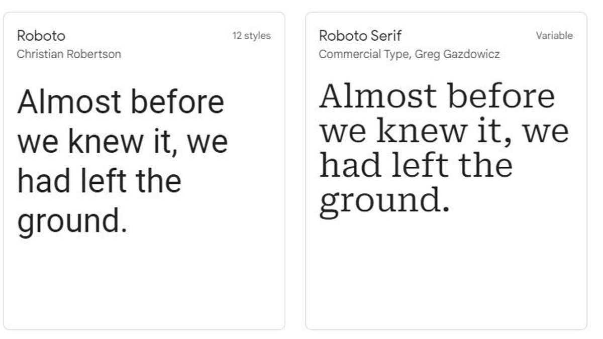
JAKARTA - Google now has the latest version of its Roboto font, and brings serif type back to life. The font's name is the aptly named Roboto Serif, and was designed in collaboration with Greg Gazdowicz of Commercial Type to create a more readable serif companion to its Roboto Sans typeface.
According to Google UX manager Rob Giampietro, the new font is not just the old Roboto font with some polished serifs, but each letter is redrawn from scratch to create a font that "people think of Roboto, but is a new and original design."
Reported by The Verge, the new font still uses the same vertical proportions of Roboto Sans, making it possible to mix serif and sans-serif versions in one design.
It might also help that the bolder retro-style serif typography is back in style in a big way, after years of dominating minimalist sans-serif designs, as Vox notes.
Serif fonts are also considered easier to read, thanks to a clearer typeface, something Google's new fonts developed for being a variable font that can automatically change and optimize fonts for different display sizes.
Google has been using the Roboto font in one form or another for more than a decade. The font was first introduced with Android 4.0 (Ice Cream Sandwich) as the default font for the company's mobile OS.
The Roboto font has had many variants over the years, though it is slowly but surely being replaced as the company's main font by Product Sans (and the Google Sans variant, also known as the "Pixel" font) across its product range.
For now, Roboto Serif has only been added to Google Fonts as another option for the company's open source Roboto family of fonts, but it's entirely possible that Google may someday use a new, friendly-looking font in its own marketing as well.
The English, Chinese, Japanese, Arabic, and French versions are automatically generated by the AI. So there may still be inaccuracies in translating, please always see Indonesian as our main language. (system supported by DigitalSiber.id)


